You’re driving traffic to your landing page, but conversions stay flat. The problem often isn’t your offer or your audience, it’s how the page is designed. Following proven landing page design best practices can mean the difference between a page that leaks leads and one that consistently turns visitors into clients.
At Client Factory, we’ve built and optimized hundreds of landing pages for service businesses and law firms. We’ve seen what works, what fails, and what moves the needle on conversion rates. The patterns are clear: small design decisions create massive differences in results.
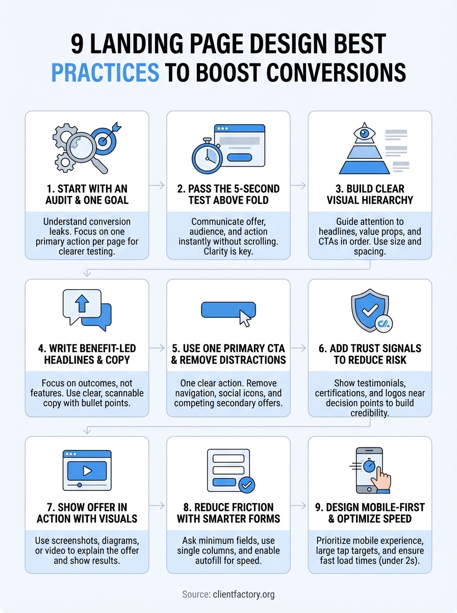
This guide breaks down nine specific practices that improve landing page performance. You’ll learn how to structure your layout, write compelling copy, design for trust, and remove friction points that kill conversions. Each practice comes from real-world testing and data, not theory.
Whether you’re building your first landing page or fixing one that underperforms, these principles will help you capture more leads without increasing your ad spend.
1. Start with a funnel audit and one goal
Most landing page redesigns fail because they skip the audit phase and try to fix everything at once. Before you change a single design element, you need to understand what’s actually breaking in your current funnel and pick one conversion goal to optimize around. This approach makes testing clearer and results faster.
What a landing page audit should include
Your audit should map the full visitor journey from traffic source to conversion. Track where visitors enter, how they scroll, where they click, and where they exit. Look at heatmaps and session recordings to see what actually holds attention versus what gets ignored. Check your form analytics to identify which fields cause abandonment. Review your mobile experience separately because mobile users behave differently than desktop visitors. This baseline tells you exactly what needs fixing instead of guessing based on design trends.
How to choose a single conversion goal
Pick the one action you want most visitors to take. For most service businesses, that’s either booking a consultation, requesting a quote, or starting a free audit. Don’t ask visitors to call, email, and fill out a form on the same page because split focus kills conversion rates. Your entire page structure, copy, and design should support this single goal. Secondary actions like downloading a resource or watching a video can exist, but they should never compete with your primary call to action.
When you optimize for one conversion goal, you make every design decision easier and every test result clearer.
The key metrics to baseline before you redesign
Capture your current conversion rate, bounce rate, and average time on page before making changes. Track these metrics by traffic source because paid traffic converts differently than organic traffic. Record your form completion rate and the specific fields where users drop off. Document page load speed on mobile and desktop. These numbers give you a clear before-and-after comparison so you know if your redesign actually improved performance or just changed how the page looks.
When to bring in Client Factory
If your internal team lacks conversion optimization experience or your landing pages consistently underperform industry benchmarks, outside help accelerates results. Client Factory starts every engagement with a free funnel audit that identifies your biggest conversion leaks and prioritizes fixes by impact. We’ve optimized landing pages for hundreds of service businesses and law firms, and we know which landing page design best practices move the needle in your industry.
2. Pass the 5-second test above the fold
Your landing page lives or dies in the first five seconds. If visitors can’t immediately understand what you offer and why it matters, they leave. The above-the-fold area needs to communicate your value proposition and primary action without any scrolling or guessing. This makes clarity your biggest design priority.
What visitors must understand immediately
Visitors should grasp three things instantly: what you offer, who it’s for, and what action to take. Your headline should state the specific outcome they’ll get, not a vague promise or company description. The supporting visual needs to reinforce that message, not compete with it. Every element above the fold should answer the visitor’s question: “Is this for me?” If they have to read multiple sentences or scroll down to figure out what you do, you’ve already lost conversions.
How to structure your hero section for clarity
Place your headline at the top left where eyes naturally land first on desktop, and center it on mobile. Keep your headline to one line if possible, two maximum. Add a short subheadline directly below that expands on the benefit or addresses a key objection. Position your hero image or video to the right on desktop, but make sure it doesn’t overpower your headline. This structure follows natural reading patterns and makes your message impossible to miss.
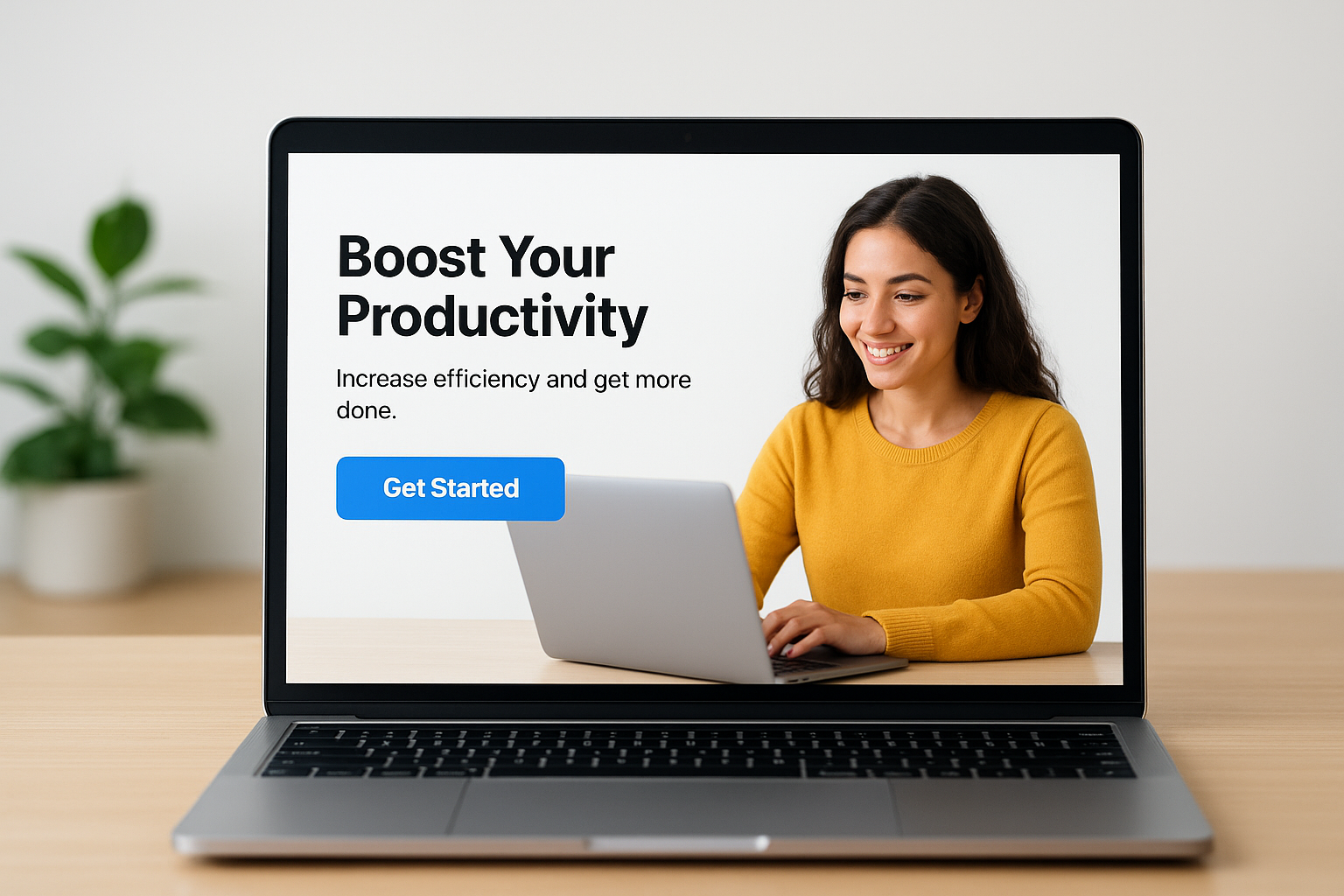
The clearest hero sections don’t try to be creative, they try to be understood in three seconds or less.
How to place your primary CTA for fast action
Your primary call-to-action button belongs immediately below your headline and subheadline, visible without scrolling. Make it stand out with high-contrast color that doesn’t appear anywhere else above the fold. Repeat the same CTA at the bottom of the page, but never place competing action buttons side by side in your hero section. Button text should start with a verb and promise a clear next step, like “Book Your Free Audit” instead of generic labels like “Learn More.”
Above-the-fold mistakes that quietly kill conversions
Stop using vague headlines that force visitors to decode what you actually do. Avoid cluttering your hero section with navigation menus, social media icons, or multiple CTAs that split attention. Don’t hide your CTA below an oversized image or make visitors scroll to find it. Skip the auto-playing videos or animation effects that slow load time and distract from your message. These landing page design best practices matter because every extra second of confusion increases your bounce rate.
3. Build a clear visual hierarchy that guides the eye
Visual hierarchy controls where visitors look first, second, and third on your landing page. When you structure your design correctly, you guide attention toward your most important elements in the exact order you want. This eliminates confusion and makes the conversion path obvious without forcing visitors to think.
How people scan landing pages on desktop and mobile
Desktop users typically follow an F-pattern: scanning the top horizontally, then moving down the left side while making shorter horizontal scans. Mobile users scroll vertically in a straight line and tap elements in the center of their screen. Your hierarchy needs to work for both patterns by placing critical information where these natural eye movements intersect. Position your headline, value proposition, and primary CTA in these high-attention zones to capture the most views.
How to use size, contrast, and spacing to create flow
Make your headline the largest text element on the page so it dominates attention. Use high-contrast colors for your CTA button that stand out from your background and surrounding elements. Add generous white space around important sections to make them feel more significant and easier to process. Decrease text size progressively as visitors move down the page to create a natural reading rhythm. This size-contrast-spacing combination creates a visual path that feels effortless to follow.
Strong visual hierarchy makes visitors feel like they’re being guided through your offer, not hunting for information.
How to use directional cues without looking gimmicky
Point faces, eyes, or arrows toward your headline or CTA to naturally direct attention where you want it. Use subtle lines, color gradients, or layout angles that lead toward conversion elements. Avoid heavy-handed tactics like giant red arrows or flashing elements that damage trust. These landing page design best practices work best when visitors notice the effect but not the technique itself.
A simple hierarchy checklist you can apply to any page
Verify your headline is larger than any other text. Confirm your CTA button uses a unique color that appears nowhere else in your hero section. Check that white space surrounds your most important sections. Test that mobile users see your headline and CTA without scrolling. Ensure your eye naturally moves from headline to subheadline to CTA without jumping around the page.
4. Write benefit-led headlines and tight supporting copy
Your copy determines whether visitors understand your offer quickly enough to convert. Most landing pages fail because they describe what they do instead of explaining what visitors get. Benefit-led copy shifts focus from features to outcomes, making your value proposition instantly clear and compelling.
How to translate features into outcomes
Stop listing your service features and start describing the specific results your clients achieve. Instead of “24/7 customer support,” write “Get answers within 60 seconds, any time of day.” Replace “Advanced analytics dashboard” with “See exactly which marketing channels drive your best clients.” Your features explain how you work, but outcomes explain why someone should care. This translation makes your landing page design best practices work harder because clear benefits reduce the mental effort required to convert.
How to write a headline, subhead, and bullets that work together
Your headline states the primary benefit in one clear sentence. The subheadline adds one layer of detail that addresses the biggest objection or clarifies who the offer serves. Bullet points below break down three to five supporting benefits that prove your headline’s promise. Each element should strengthen the others without repeating information. This hierarchy lets visitors grasp your complete offer in seconds by reading just the bold, large-text elements.
How to keep copy scannable without dumbing it down
Break long paragraphs into two to three sentences maximum. Use bullet points to list multiple benefits or process steps. Bold the most important phrases in each paragraph so skimmers catch your key points. Add subheadings every few paragraphs to mark new topics. You can maintain sophistication while making your copy easy to scan by choosing precise words over complex sentence structures.
Scannable copy respects your visitor’s time without sacrificing the depth they need to make a confident decision.
Copy mistakes that create confusion and bounce
Remove industry jargon that forces visitors to decode your message. Stop using vague promises like “best-in-class solutions” or “industry-leading results” that mean nothing specific. Avoid long introductory paragraphs that bury your value proposition. Cut any sentence that doesn’t directly support your conversion goal. These copy fixes often produce bigger conversion lifts than design changes because clarity removes the friction that causes visitors to leave.
5. Use one primary CTA and remove distractions
Your landing page should push visitors toward one clear action, not offer multiple choices that split their attention. When you ask visitors to call, email, and fill out a form on the same page, conversion rates drop because decision paralysis sets in. Every competing element you remove makes your primary call to action stronger and your conversion rate higher.
How to pick your one primary CTA and label it
Choose the action that delivers maximum business value while requiring the least commitment from visitors. For most service businesses, that’s booking a consultation or requesting a quote. Your CTA button text should start with an action verb and promise a specific next step like “Schedule Your Free Audit” or “Get Your Custom Quote.” Avoid generic labels like “Submit” or “Click Here” that fail to communicate what happens after the click.
What to remove or de-emphasize on most landing pages
Strip out your main navigation menu that gives visitors easy exits to other pages. Remove social media icons, embedded blog feeds, and outbound links that don’t support conversion. De-emphasize your phone number by placing it in the header or footer instead of competing with your primary CTA. These landing page design best practices eliminate escape routes that leak conversions.
When you remove distractions, you force visitors to choose between your offer and leaving, which increases commitment to your primary action.
How to handle secondary actions without splitting attention
Place secondary CTAs like “Watch Demo Video” or “Download Guide” below your primary conversion point so they support the main goal instead of competing with it. Use text links or ghost buttons with minimal visual weight rather than bold, colorful buttons. Limit yourself to one secondary action per page to maintain focus.
CTA design rules for buttons, contrast, and placement
Make your CTA button the highest-contrast element on your page using a color that appears nowhere else. Size it large enough to tap easily on mobile, typically 44×44 pixels minimum. Position it above the fold in your hero section and repeat it after key benefit sections. Keep button text to five words or less so visitors can read and act quickly.
6. Add trust signals that reduce perceived risk
Visitors need proof that your offer delivers before they convert. Trust signals reduce the perceived risk of taking action by showing evidence that others have succeeded with your service. These elements don’t need to dominate your page, but they must appear strategically positioned near decision points to influence conversion when it matters most.
The trust signals that matter most for service businesses
Display client logos from recognizable companies you’ve served, especially if they operate in the same industry as your target visitor. Show specific results in testimonials that include the client’s name, photo, and company rather than anonymous quotes. Include third-party certifications, awards, or ratings that verify your expertise. List your years in business and number of clients served if those numbers strengthen your credibility. These landing page design best practices work because they provide external validation that your claims hold up.
Where to place trust elements so they support the CTA
Position your strongest testimonial immediately after your primary CTA to reinforce the decision visitors just considered. Place client logos near your value proposition to build credibility early. Add security badges and privacy assurances directly next to your form fields where visitors enter sensitive information. Space trust signals throughout your page rather than clustering them in one section, so each benefit claim has nearby proof.

Trust signals work best when they appear at the exact moment a visitor questions whether to believe your promise.
How to avoid trust killers like vague claims and stock imagery
Stop using generic stock photos that visitors recognize from other websites. Remove testimonials that sound too perfect or vague without specific outcomes or measurable results. Avoid badges or certifications that mean nothing to your audience or can’t be verified. Replace claims like “trusted by thousands” with exact numbers and named clients when possible.
Trust and compliance basics for lead capture pages
Link to your privacy policy near every form so visitors know how you handle their data. Display SSL security indicators in your browser bar and mention encryption if you collect payment information. Include clear terms about what happens after form submission and how quickly you’ll respond. Add compliance statements required for your industry, such as attorney disclaimers or healthcare privacy notices.
7. Show the offer in action with purposeful visuals
Your visuals should explain what you deliver, not just decorate your page. The right image or video helps visitors grasp your offer instantly while poor visuals create confusion or distraction. Choose visuals that demonstrate your service in action rather than generic stock photos that could appear on any landing page.
How to choose a hero visual that explains the offer fast
Pick a hero image that shows your service outcome or process in a way that requires minimal explanation. If you sell software, show the actual interface with key features visible. For service businesses, display real client work or the results your clients achieve. Avoid abstract concepts or lifestyle imagery that forces visitors to guess what you actually deliver. Your hero visual should make your headline more believable by providing instant visual proof.
When to use screenshots, photos, diagrams, or video
Use product screenshots when your service involves a tool or dashboard that visitors need to see. Choose photos of your team or workspace when personal connection matters for your conversion. Deploy diagrams or flowcharts to explain complex processes in a scannable format. Add video when demonstrating your service requires motion or when showing before-and-after transformations. Each format serves a different purpose in your landing page design best practices toolkit.
The best visuals answer questions before visitors need to read a full paragraph of explanation.
How to caption visuals so they reinforce your message
Write captions that highlight specific benefits shown in the image rather than describing what’s obviously visible. Point out features that visitors might miss without guidance. Keep captions to one or two sentences that strengthen your value proposition instead of repeating your headline.
Visual mistakes that distract instead of convert
Stop using stock photos of smiling people in business settings that communicate nothing about your actual service. Remove carousels or sliders that hide important information behind clicks. Avoid oversized images that push your CTA below the fold on mobile devices. Cut any visual that doesn’t directly support your conversion goal.
8. Reduce friction with smarter forms and field design
Your form determines whether visitors who want to convert actually complete the action. Every unnecessary field increases abandonment rate, and poor formatting creates errors that frustrate users into leaving. Smart form design removes these friction points by asking only what you need and making completion as fast as possible.
How to decide what to ask for and what to skip
Request only the minimum information required to follow up effectively. For most service businesses, that means name, email, and phone number. Add one qualification question if you need to filter leads, but remove fields like company size or job title unless they directly impact your sales process. Each additional field costs you conversions, so every question needs to justify its existence by providing value that outweighs the friction it creates.
How to format forms for speed and fewer errors
Stack form fields vertically in a single column rather than placing them side by side, which improves mobile usability and scanning speed. Use field labels that stay visible after users start typing instead of placeholder text that disappears. Enable autofill and autocomplete so browsers can populate fields automatically. Add inline validation that flags errors immediately rather than after submission.
Forms that feel fast to complete convert at higher rates than forms that require the same information but feel tedious.
When to use multi-step forms vs single-step forms
Deploy multi-step forms when you need to collect six or more fields because breaking them into smaller chunks reduces perceived effort. Use single-step forms for three fields or fewer since adding steps creates unnecessary clicks. Test both formats with your audience because these landing page design best practices vary by industry and offer complexity.
How to design confirmation states and next steps after submission
Display a clear confirmation message immediately after form submission that tells visitors exactly what happens next and when to expect contact. Include a secondary action like “Add to Calendar” or “Download Our Guide” to keep engagement going. Avoid redirecting to a generic thank-you page that provides no additional value or clear instructions.
9. Design mobile-first and optimize speed
Mobile traffic accounts for the majority of landing page visits, yet most businesses still design for desktop first and adapt down. This approach creates slower load times and awkward mobile experiences that kill conversions. Mobile-first design starts with the smallest screen and builds up, resulting in faster pages that convert better across all devices.
What mobile-first actually changes in layout and content
Mobile-first forces you to prioritize essential elements because space is limited. Your headline, primary value proposition, and CTA must appear within the first screen view without scrolling. Remove or collapse secondary navigation, reduce paragraph length to three sentences maximum, and stack all content in a single column. This constraint makes your message clearer and your conversion path more direct on every device.
How to make pages thumb-friendly and readable
Design tap targets at least 44×44 pixels so visitors can accurately hit buttons and links with their thumbs. Increase font size to 16 pixels minimum for body text to eliminate the need for zooming. Space interactive elements far enough apart that accidental taps don’t trigger wrong actions. These landing page design best practices prevent the frustration that causes mobile visitors to abandon before converting.
Mobile-friendly design isn’t about shrinking desktop layouts, it’s about removing everything that slows down the path to conversion.
Speed fixes that usually produce the biggest wins
Compress and properly size all images before uploading so they load in under two seconds. Enable browser caching and implement lazy loading for images below the fold. Minimize JavaScript that blocks initial page rendering. Remove unnecessary plugins or tracking scripts that add load time without supporting conversion.
How to QA your page across devices and browsers
Test your page on actual mobile devices running iOS and Android, not just desktop browser simulators. Check load speed using real mobile network conditions, not just WiFi. Verify forms work correctly and CTAs remain visible across different screen sizes. Review your page in Chrome, Safari, Firefox, and Edge to catch browser-specific rendering issues.
Next steps
You now have nine proven strategies to transform your landing page from a traffic sink into a conversion engine. These landing page design best practices work because they eliminate friction, build trust, and guide visitors toward one clear action. Your next move determines whether this knowledge sits unused or drives real business results.
Start by auditing your current landing page against these principles. Identify which practices you’re missing and prioritize fixes that address your biggest conversion leaks first. Focus on the fundamentals like clarity, hierarchy, and removing distractions before optimizing smaller details.
If you want professional help implementing these strategies, Client Factory offers a free funnel audit that pinpoints exactly what’s holding back your conversions. We’ll review your landing page, identify quick wins, and show you the specific changes that will drive more qualified leads. Schedule your conversion audit and we’ll map out your fastest path to better results.

