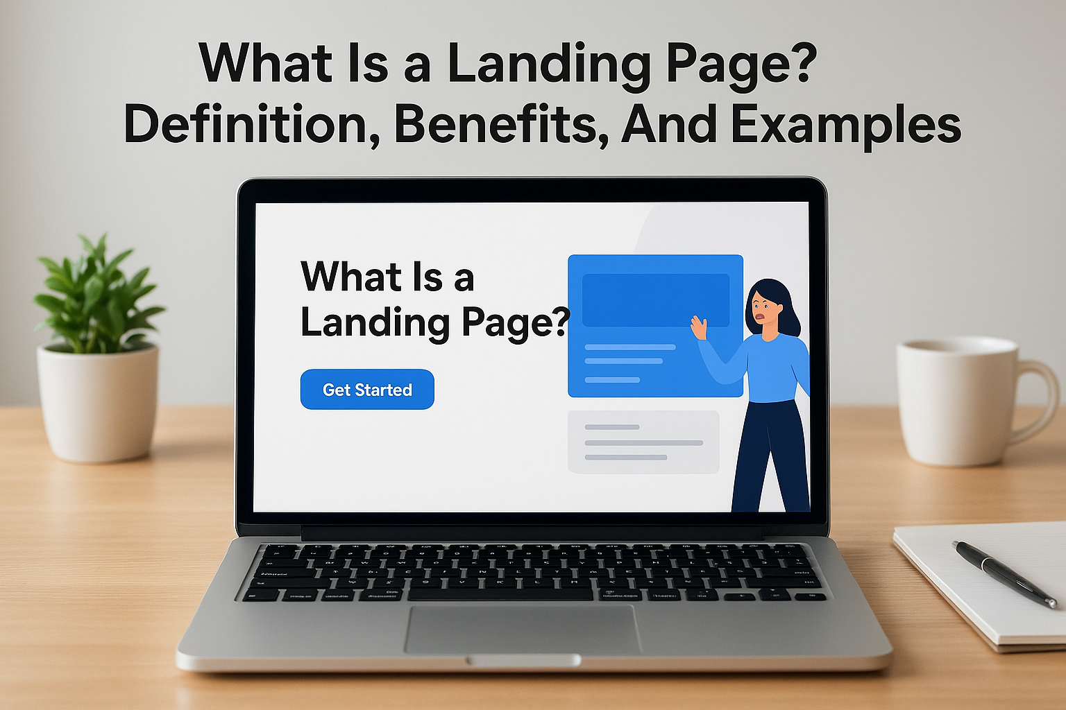
You’re running ads, posting content, and driving traffic, but conversions aren’t happening. The problem often isn’t your offer or your audience. It’s where you’re sending them. Understanding what is a landing page and how it functions differently from your main website is the first step toward fixing a leaky funnel.
A landing page is a standalone web page built for one specific purpose: to convert visitors into leads or customers. Unlike your homepage, which serves as a general introduction to your business, a landing page strips away distractions and focuses entirely on a single call to action. This distinction matters more than most business owners realize, especially when every click costs money and attention spans are measured in seconds.
At Client Factory, we build client acquisition funnels for service businesses and law firms, and landing pages sit at the heart of that process. This guide breaks down exactly what landing pages are, how they work, why they outperform traditional pages for conversions, and what separates high-performing examples from the rest. Whether you’re launching your first campaign or auditing an existing funnel, you’ll walk away with a clear understanding of how to turn more of your traffic into paying clients.
Why landing pages matter in digital marketing
Your homepage tries to serve everyone. Your landing page serves one person with one problem at one moment. That difference determines whether your marketing budget generates leads or burns cash. Most businesses send traffic from ads, emails, and campaigns directly to homepage URLs or generic service pages, which dilutes the message and splits attention across multiple offers, links, and navigation options. Landing pages solve this by eliminating every element that doesn’t push the visitor toward your conversion goal.
They maximize ROI from paid traffic
You pay for every click that arrives from Google Ads, Facebook, or LinkedIn. When those clicks land on a page optimized for a single conversion, your cost per lead drops while conversion rates climb. A homepage might convert at two percent because visitors get lost in navigation, explore unrelated services, or click away to read your blog. A focused landing page removes those escape routes and channels attention toward the form, phone call, or purchase button you actually want them to use.
The data backs this up. Businesses using dedicated landing pages for campaigns typically see conversion rates three to five times higher than those sending traffic to standard website pages. That gap compounds when you’re spending hundreds or thousands per month on advertising. Understanding what is a landing page and implementing them correctly means you need fewer clicks to hit the same lead targets, which directly improves your return on ad spend.
Every dollar you invest in paid traffic deserves a page built specifically to convert that traffic, not a general page built to inform casual browsers.
They create focused customer journeys
Landing pages work because they control what happens next. Your visitor arrived because they clicked on a specific promise in an ad, email, or social post. They expect continuity between that promise and where they land. Generic pages break that continuity by introducing new information, competing offers, and navigation menus that invite distraction.
A well-built landing page maintains message match from the traffic source through to the conversion point. The headline reinforces the ad copy. The offer matches what was promised. The call to action asks for exactly what you told them they’d be able to do. This alignment keeps visitors engaged and moving toward the goal instead of second-guessing whether they’re in the right place.
They enable precise tracking and optimization
Marketing decisions based on guesswork cost you money. Landing pages give you clean, isolated data about what works and what doesn’t. When you send campaign traffic to a dedicated page, you can measure exactly how many visitors converted from that specific source, offer, and message combination. That clarity becomes impossible when multiple campaigns dump traffic onto the same homepage or service page.
You can test different headlines, images, form lengths, and copy variations on separate landing pages, then scale what performs best. This testing happens faster and produces clearer results because each page serves one audience segment with one clear objective. Your analytics show you which version generated more leads, not which version got more general website traffic that may or may not have converted.
Performance measurement extends beyond conversion rates. You track cost per acquisition, lead quality scores, and customer lifetime value tied directly to specific landing pages. This visibility lets you shift budget toward campaigns and pages that deliver profitable clients while cutting spend on those that don’t.
Landing page vs homepage and other web pages
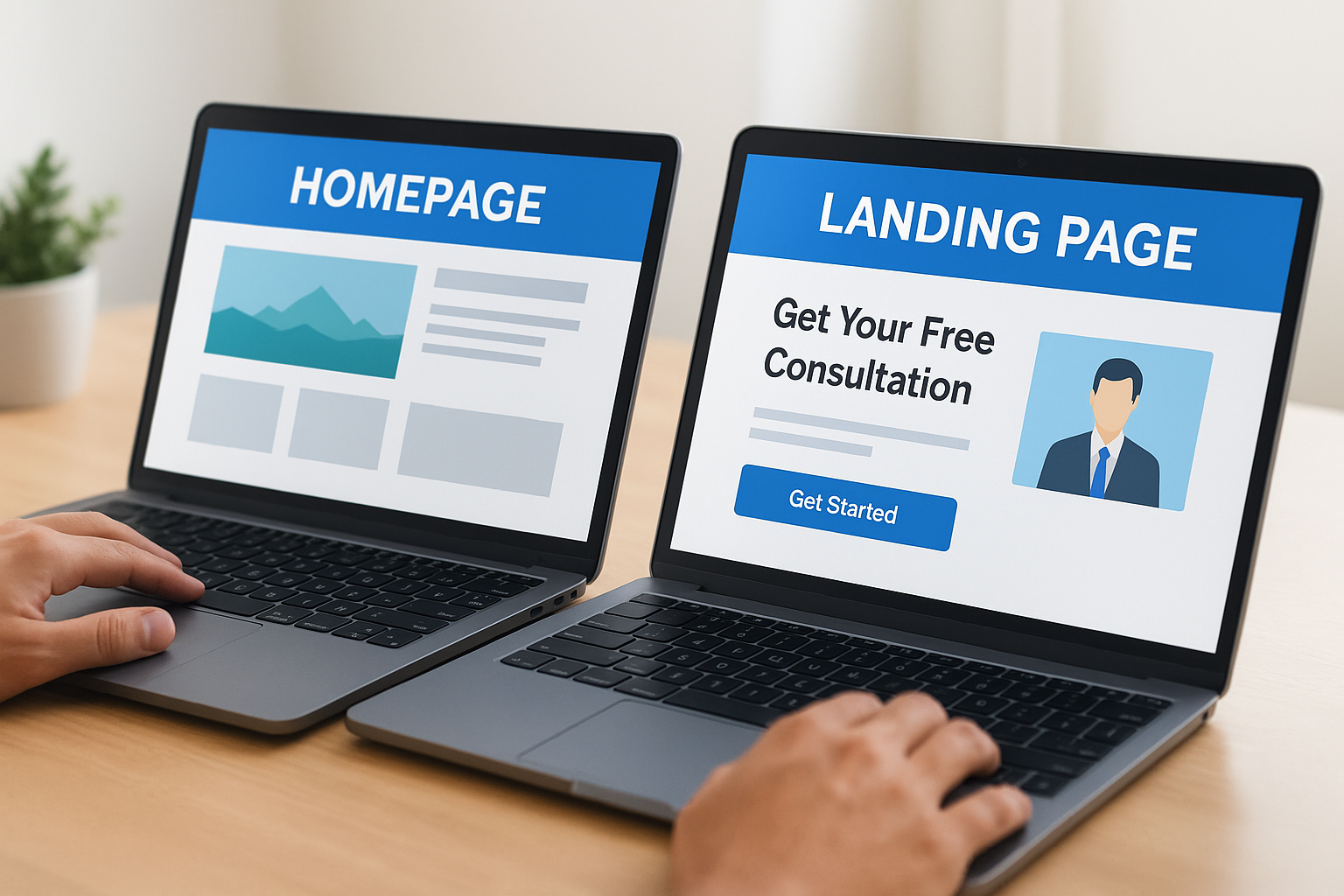
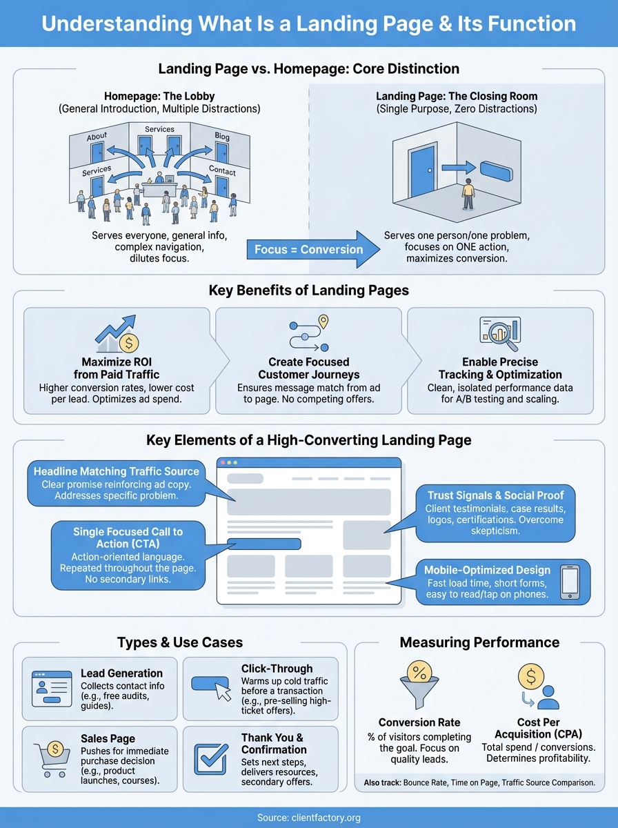
Your homepage is a lobby. Your landing page is a closing room. Confusing these two costs you conversions because they serve fundamentally different functions in your marketing strategy. Business owners often wonder what is a landing page and why they can’t just send traffic to their existing site pages. The answer lies in how these pages are structured, what they’re designed to accomplish, and how visitor behavior changes based on where they land.
Homepage serves multiple purposes, landing pages serve one
Your homepage welcomes everyone who might visit your site. It introduces your brand, showcases your services, links to your blog, displays client testimonials, and provides navigation to every corner of your website. This structure makes sense for organic traffic and people exploring your business, but it creates decision paralysis for visitors arriving with specific intent from a paid ad or email campaign.
Landing pages eliminate that paralysis by removing navigation menus, footer links, and competing calls to action. You built them for one audience segment responding to one specific offer. A visitor who clicked an ad about free case evaluations sees exactly that offer reinforced with social proof, a simple form, and nothing else. No sidebar links to your blog. No menu options leading to your about page. Just the path from headline to conversion.
Your homepage asks visitors to explore. Your landing page asks them to convert.
Other web pages dilute focus, landing pages maintain it
Service pages, blog posts, and product category pages all share a common weakness when used as landing destinations. They weren’t built to convert cold traffic from a single campaign. Service pages list multiple offerings with internal links to other services. Blog posts include related article suggestions and comment sections. Product pages show navigation to other categories and search bars that invite browsing.
These elements serve visitors who arrive through organic search and want to explore your full catalog or learn more about your company. Campaign traffic needs tighter control. A prospect who clicked your LinkedIn ad offering a marketing audit expects that specific offer front and center, not a general services overview with ten different ways to navigate away. Landing pages solve this by treating every element as either contributing to conversion or creating friction. Everything that doesn’t directly support your single conversion goal gets removed.
Types of landing pages and when to use each
Not all landing pages serve the same purpose. The type you choose depends on where your prospect sits in their buying journey and what action you need them to take next. Understanding what is a landing page in each specific context helps you match the page design to your campaign goal. Service businesses and law firms typically rotate between four main landing page types, each built to convert visitors at different stages of awareness and commitment.
Lead generation pages
These pages collect contact information in exchange for something valuable. You use them when your goal is building a database of qualified prospects rather than making an immediate sale. The typical structure includes a headline, benefit-focused copy, a lead capture form, and social proof elements that build trust before asking for information.
Lead generation pages work best for high-consideration purchases where prospects need nurturing before buying. Law firms use them to offer free case evaluations. Service businesses deploy them for audit requests, consultation bookings, or downloadable guides. The conversion threshold stays low because you’re asking for an email address and maybe a phone number, not a purchase commitment.
Click-through pages
These pages warm up cold traffic before sending them to a transaction. You build them to pre-sell prospects on your offer and overcome objections before they reach your shopping cart or scheduling system. Click-through pages contain no forms because the goal is education and persuasion, not data collection. Visitors read your copy, review your offer details, and click through to complete the action on the next page.
Click-through pages increase conversion rates by filtering out unqualified visitors before they reach your checkout process.
Use them when your offer requires explanation or when you’re running high-ticket campaigns where price resistance needs addressing upfront. The page gives you space to establish value, showcase testimonials, and answer common questions before prospects commit time to filling out forms or entering payment information.
Sales pages
Sales pages push for immediate purchases. They combine long-form copy with multiple calls to action positioned throughout the page as visitors scroll. You deploy them for product launches, course sales, and any offer where the buying decision happens on that single page without additional nurturing steps.
These pages work when your audience already understands their problem and recognizes they need a solution. Your copy focuses on positioning your specific solution as the best choice rather than educating them on the problem itself.
Thank you and confirmation pages
These pages appear after conversions and serve strategic purposes beyond simple acknowledgment. You use them to set expectations about next steps, deliver promised resources, and introduce secondary offers to newly converted leads while their engagement peaks.
Confirmation pages also provide conversion tracking endpoints for your analytics platforms and advertising pixels, making them essential infrastructure pieces rather than afterthoughts.
Key elements of a high-converting landing page
Every element on your landing page either moves visitors toward conversion or creates friction that stops them. Understanding what is a landing page at the component level means recognizing which pieces drive action and which ones distract from your goal. High-performing pages share consistent structural elements regardless of industry or offer type. These components work together to maintain focus, build trust, and eliminate reasons for prospects to leave without converting.
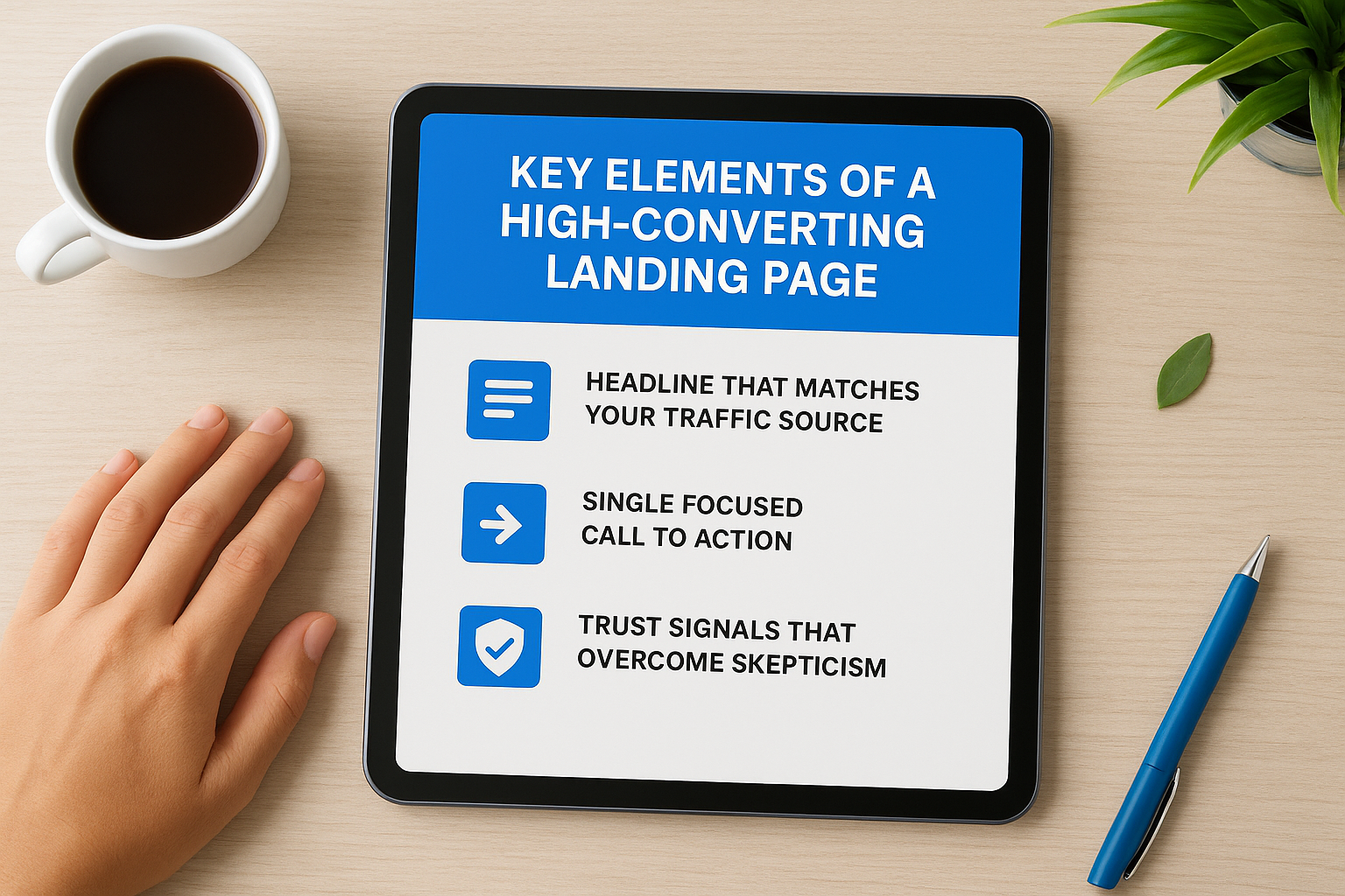
Headline that matches your traffic source
Your headline determines whether visitors stay or bounce within three seconds of arrival. You write it to reinforce the exact promise that brought them to your page, creating immediate continuity between your ad copy or email subject line and the landing experience itself. A prospect who clicked an ad about “free marketing audits” expects those words reflected in your headline, not a generic company tagline or vague value proposition that forces them to figure out if they’re in the right place.
Strong headlines connect directly to the traffic source and speak to one specific problem your visitor wants solved.
Test different headline variations that address pain points, desired outcomes, or specific objections while maintaining message match. Your headline sits above the fold and typically carries the largest font size on the page, making it the anchor point for everything that follows.
Single focused call to action
High-converting pages ask for one thing. You eliminate secondary navigation, multiple offers, and competing buttons that split attention and create decision fatigue. Your call to action appears multiple times as visitors scroll, but it always asks for the same commitment whether that’s filling a form, scheduling a call, or starting a trial.
Button copy matters more than most marketers realize. Replace generic phrases like “submit” with action-oriented language that reinforces the benefit. “Get Your Free Audit” converts better than “Submit Form” because it reminds prospects what they receive in exchange for their information.
Trust signals that overcome skepticism
Cold traffic needs proof before converting. You build credibility through client testimonials, case study results, industry certifications, and social proof elements positioned near your call to action. Specific numbers outperform vague claims. “Generated 47 qualified leads in 30 days” creates more trust than “helped our clients grow.”
Display logos from recognizable brands you’ve worked with when possible. Include photos with testimonials rather than text-only quotes, and add full names and companies to prove authenticity.
Mobile-optimized design
Over half your traffic arrives on phones. Your landing page loads fast, displays properly on small screens, and keeps forms short enough to complete without frustration. Test your page on actual devices to catch formatting issues that desktop previews miss. Large tap targets, readable font sizes, and minimal scrolling separate mobile-friendly pages from those that hemorrhage conversions on smartphones.
Landing page examples for common marketing goals
Real landing pages demonstrate how structure matches intent. Examining what is a landing page through actual examples helps you understand which design patterns convert for specific campaign types. The following examples represent common marketing objectives for service businesses and law firms, showing how successful pages align their elements with visitor expectations and conversion goals.
Legal consultation request pages
Law firms use these pages to convert prospects searching for immediate legal help into consultation bookings. The page opens with a headline addressing the specific practice area, like “Injured in an Accident? Get Your Free Case Review.” Copy focuses on problem awareness rather than firm credentials, highlighting the visitor’s situation before introducing the solution. The form requests minimal information because legal prospects hesitate to share details before speaking with an attorney. You include trust elements like bar association memberships, case results, and client testimonials positioned near the booking form. A phone number displays prominently for prospects who prefer calling over form submission.
Service audit or assessment pages
These pages convert cold traffic by offering free value upfront in exchange for contact information. Marketing agencies and consulting firms deploy them to qualify prospects while demonstrating expertise. The headline promises a specific deliverable like “Get Your Marketing Funnel Audit” followed by bullet points explaining what the audit includes and what results it typically uncovers. You show example audit reports or screenshots to prove the offer’s tangible nature. The form captures business size, current challenges, and timeline information that helps you prioritize follow-up conversations with qualified leads.
Pages offering free audits or assessments convert best when they show exactly what the prospect receives rather than describing it abstractly.
Webinar registration pages
You build these pages to fill event seats by emphasizing learning outcomes and speaker credibility. The headline states the webinar topic and date/time clearly so prospects know the commitment required. Bullet points outline specific takeaways attendees gain, and you include speaker photos with credentials that establish authority on the subject. Social proof appears as registration counts or logos from companies whose employees have previously attended. The form asks only for name and email because reducing friction matters more than collecting detailed data. You add calendar integration buttons post-registration to minimize no-show rates by making it easy for registrants to block their time.
Free trial or demo pages
Software and service providers use these pages to convert prospects ready to test solutions before buying. Copy addresses specific use cases and pain points your product solves, supported by feature screenshots or video demos. You list what’s included in the trial period and clarify that no credit card is required when that’s true. Testimonials focus on results achieved during trial periods rather than long-term customer relationships. The call to action emphasizes speed and ease, using phrases like “Start Your Free Trial in 60 Seconds” to lower perceived barriers.
How to create a landing page step by step
Building your first landing page feels overwhelming when you’re staring at blank templates and design options. The process becomes manageable when you break it into sequential decisions that prioritize conversion over creativity. You don’t need design skills or technical expertise to launch pages that generate leads consistently. You need a clear process that keeps your visitor’s journey and conversion goal at the center of every choice you make.
Define your conversion goal and audience
Start by deciding exactly what action you want visitors to take. You write this as one specific outcome like “schedule a consultation,” “download the guide,” or “start a free trial.” Your entire page structure flows from this single goal. Then identify the audience segment this page serves, including their awareness level and the traffic source bringing them here. A cold Facebook ad audience needs different messaging than warm email subscribers who already know your brand.
Document the promise from your traffic source so you maintain message match from click to landing. If your ad said “Get a Free Marketing Audit,” that exact phrase appears in your headline and call to action. This alignment prevents the confusion that causes immediate bounces.
Write conversion-focused copy
Your headline reinforces the traffic source promise while speaking directly to one specific problem your visitor wants solved. Follow it with subheadlines and body copy that explain what they receive, why it matters, and what happens after they convert. Focus on benefits over features, addressing objections before they form. You include social proof elements like testimonials and results near your form to build trust at the decision point.
The best landing page copy answers three questions in order: what you get, why it solves their problem, and why they should trust you to deliver it.
Keep paragraphs short and scannable. Use bullet points to break down complex offers or multi-step processes. Replace industry jargon with plain language that matches how your audience describes their problems in search queries and conversations.
Design for clarity and action
You strip away navigation menus, footer links, and sidebar elements that create escape routes. Your design guides eyes down the page toward one call to action that appears multiple times as visitors scroll. Choose contrasting button colors that stand out from your background while maintaining readability and brand consistency. Forms request only the information you absolutely need because each additional field drops conversion rates.
Test your page on mobile devices where most traffic arrives. Verify that buttons are large enough to tap easily, text remains readable without zooming, and forms work smoothly on smaller screens.
How to drive traffic to a landing page
Your landing page converts nothing without visitors. You built it for one specific purpose, but that focus means nothing if nobody arrives to see your offer. The traffic sources you choose determine not just volume but visitor quality and conversion rates. Cold traffic from paid ads behaves differently than warm prospects from your email list, and understanding these distinctions helps you allocate budget toward channels that deliver qualified leads rather than empty clicks.
Paid advertising channels
You drive immediate traffic through Google Ads, Facebook, LinkedIn, and other paid platforms where you control audience targeting and budget allocation. These channels work fastest when you need quick validation of your offer and messaging before scaling. Search ads on Google catch prospects actively looking for solutions, giving you high-intent traffic that converts well when your headline matches their query. Display and social ads reach people earlier in their buying journey, requiring stronger copy and value propositions to overcome skepticism.
Budget paid campaigns based on your cost per acquisition goals rather than traffic volume alone. A campaign generating 100 clicks at low conversion rates costs more per lead than one delivering 30 clicks that convert at higher percentages. Test different audience segments and ad variations systematically, directing each to dedicated landing pages that maintain message match from ad copy through conversion.
Your paid traffic budget should flow toward campaigns and audiences that generate leads at or below your target cost per acquisition, not toward those that simply generate the most clicks.
Organic and email traffic
Search engine optimization brings qualified visitors without ongoing ad spend when you rank for terms your target prospects search. You earn these rankings by publishing content that answers questions around your offer, building backlinks from relevant sites, and optimizing technical elements that affect visibility. Email campaigns to your existing subscriber base convert better than cold traffic because these prospects already know your brand and trust your expertise.
Segment your email list based on engagement levels and past behavior so you send landing page offers to those most likely to convert. A prospect who downloaded your previous lead magnet represents warmer traffic than someone who only opens emails occasionally without clicking.
Retargeting and nurture campaigns
You recapture visitors who left without converting by showing them ads across Facebook, Google Display Network, and other platforms. Retargeting works because it reaches people who already demonstrated interest by visiting your site or engaging with previous content. These campaigns cost less per click than cold acquisition while generating higher conversion rates because you’re addressing prospects who already understand what is a landing page and why your specific offer matters to them.
Build nurture sequences that send educational content followed by landing page offers to prospects who need multiple touchpoints before converting. Service businesses and law firms see strongest results when they provide value first through guides, case studies, or insights before asking for consultation bookings or purchases.
How to measure landing page performance
Your landing page generates data with every visitor, but only specific metrics tell you whether it’s actually working. You track these numbers to identify what’s driving conversions and what’s costing you money without results. Most businesses drown in vanity metrics like total page views while ignoring the conversion data that determines profitability. Measuring landing page performance means focusing on metrics that connect directly to revenue and lead quality, then using those insights to optimize your campaigns systematically.
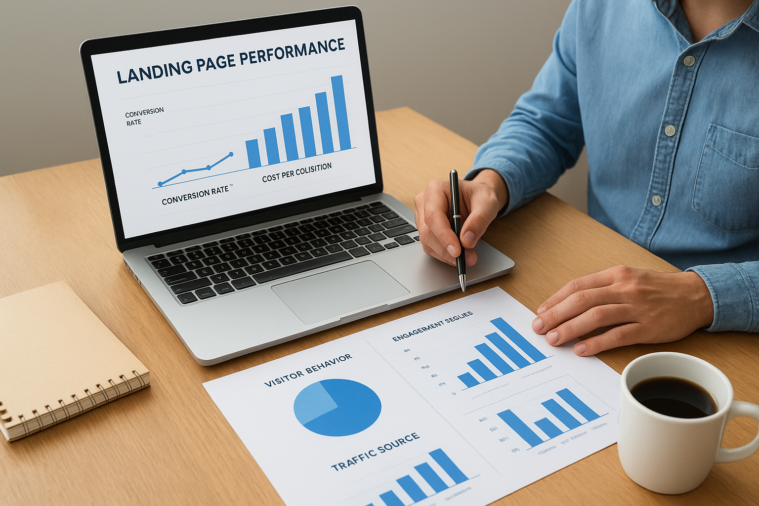
Conversion rate and cost per acquisition
Your conversion rate shows what percentage of visitors complete your desired action. You calculate it by dividing total conversions by total visitors, then multiplying by 100. A page with 50 conversions from 1,000 visitors converts at five percent. This metric matters more than traffic volume because a page converting at 10 percent with 500 visitors generates more leads than one converting at two percent with 2,000 visitors.
Cost per acquisition reveals how much you spend to generate each lead or sale. You divide your total campaign spend by the number of conversions that campaign produced. If you spent $500 on ads and generated 25 leads, your cost per acquisition sits at $20. Track this metric by traffic source and landing page to identify which combinations deliver leads at profitable rates and which burn budget without returns.
Your cost per acquisition determines whether a campaign scales profitably or bleeds money as you increase spend.
Visitor behavior and engagement signals
Bounce rate measures the percentage of visitors who leave without interacting with your page. High bounce rates above 70 percent typically indicate message mismatch between your traffic source and landing page content, or technical issues that prevent proper loading. You investigate these bounces by reviewing the exact ads or links sending traffic and verifying your page displays correctly across devices.
Time on page and scroll depth show whether visitors engage with your content before converting or bouncing. Landing pages with average times under 30 seconds often suffer from weak headlines or offers that fail to capture attention. Tracking which sections visitors reach before leaving helps you identify where your copy loses prospects and needs strengthening.
Traffic source performance comparison
You break down conversion rates and costs by individual traffic channels to understand which sources deliver qualified prospects. Google Ads might convert at eight percent while Facebook traffic converts at three percent, signaling that you should shift budget toward the higher-performing channel. Compare not just conversion rates but also lead quality scores and customer lifetime value when available, since some sources generate cheaper leads that never become paying clients.
Common landing page mistakes and how to fix them
Most landing pages fail not because of missing features but because of fixable errors that actively prevent conversions. You recognize these mistakes by watching your bounce rates climb and conversion rates stall despite driving quality traffic. The gap between what is a landing page theoretically and what yours delivers practically often comes down to three recurring problems that sabotage results across industries. Fixing them requires identifying the specific friction points stopping your visitors from converting, then systematically removing or redesigning those elements.
Asking for too much information upfront
Your form determines conversion rates more than any other page element. You lose prospects every time you add another required field because each question raises the perceived commitment level and increases abandonment risk. Forms requesting company size, annual revenue, detailed problem descriptions, and preferred contact times convert at a fraction of the rate compared to those asking only for name and email.
Audit your form by testing a simplified version that collects only the minimum viable information needed to follow up. You can gather additional details during your sales conversation rather than at the conversion point. Phone number fields drop conversion rates by 5 to 20 percent depending on your audience, so make them optional unless your follow-up process requires calling. Progressive profiling through multi-step forms works when you break the process into logical stages rather than presenting one intimidating wall of fields.
Weak or confusing value propositions
Visitors decide whether to stay or leave based on your headline and the clarity of your offer. Generic headlines like “Solutions for Your Business” or “Let’s Work Together” fail to communicate what prospects actually receive in exchange for their information. You fix this by replacing vague language with specific outcomes and deliverables that answer the question “what do I get?”
Your value proposition should make it impossible for visitors to misunderstand what they receive and why it solves their specific problem.
Test headlines that include numbers, timeframes, or concrete results. “Get 47 Pre-Qualified Leads in 30 Days” outperforms “Grow Your Business” because it sets measurable expectations and speaks to a defined outcome.
Slow load times and technical issues
Your page converts nothing if it doesn’t load. Visitors abandon pages that take longer than three seconds to display, and mobile users show even less patience. You check load speed using tools that identify which elements slow performance, then compress images, remove unnecessary scripts, and optimize code. Pages loading slowly on mobile devices hemorrhage conversions because most traffic arrives from smartphones where connection speeds vary.
Broken forms represent another critical failure point. You test your conversion process on multiple devices and browsers to catch validation errors, submission failures, or confirmation issues that stop prospects from completing the action you’re asking for.
Where to go from here
You understand what is a landing page, how it differs from other web pages, and which elements drive conversions. The next step involves putting this knowledge into action by building pages that turn your traffic into measurable business results. You’ll see the difference when your ads, emails, and campaigns send prospects to focused conversion tools rather than general website pages that dilute your message.
Start with one campaign and one clear goal. Build a landing page that eliminates distractions and guides visitors toward that single action. Test your headline against your traffic source, simplify your form, and add trust elements that overcome objections. Track your conversion rates and cost per acquisition, then optimize based on actual performance data rather than assumptions.
If you need help building client acquisition funnels that consistently convert traffic into paying clients, schedule a free funnel audit with Client Factory. We’ll identify exactly where your current process loses prospects and show you how to fix it.

